
Yes, I wrote a tutorial. I had a chance to look at my own drawing process and try to find something useful for other people 😉
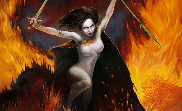
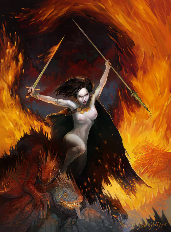
In this tutorial, I will tell you how I created the image Rising (Pict.1).
This piece has been made as a tribute to Frank Frazetta for exhibition in Gallery Provocateur on Saturday, March 19th, 2011 8:00~12:00 in the evening, at 2125 N Rockwell, Chicago, IL 60647.
I wanted to take a lot of Frazetta and mix it with me. As you can see, in the end it came out with more of me and less of Frazetta. 😉
Part 1. Preparing
The main idea: The main idea was to depict a female warrior with evil creatures. In this picture I tried to use an iconic image of an evil warrior. So, there must be lifeless, cold and aggressive features in her appearance. Moreover, she must be an attractive and sexy woman.
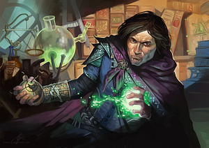
References: I am always trying to find good references for my work. For example, when I need to draw mountains I go to Flicr or DeviantArt galleries and search there for interesting photos of mountains. I live in area without mountains, so I don’t have many fresh ideas concerning this type of landscape. In such galleries, I can find really interesting visual ideas from photos of other people who are fortunate enough to live and see what I cannot. The same situation happens when I work on other subjects that are not common for me or my environment. You can read more about references in artist’s work in a great article by Christopher Burdett, great words!
In this case, I used a few works by Frank Frazetta (see more of his artwork) to get the right feeling for his style and the most important features. I used a few images for color inspiration and my wife as model, who is always near and I can always ask to sit for me (Pict.2).
Part 2. Sketching
Sketch: In my case, an underpainting and sketching is the same thing. I use for a sketch the same file as for the final drawing.When I was sketching for Rising I had to decide what would be the main idea of this image. I had to find the special mood, an expression in this work. So, I didn’t draw anything in detail. Actually, I didn’t know what some of the objects in my work were. For example, in Pict.3 you can see in the right bottom corner a clawed paw. I didn’t know what particular creature has this paw. I just felt that it would be a creature, a monster, maybe, with a very long tail or crest along the whole back. I didn’t know what jewelry or clothes the main character would wear, and what would be in the background either. There is a quite abstract idea of how the whole image would look.
When I sketched, I used pale colors and light shadows. The whole sketch looked very light and pale, but this helped me to keep my attention on the most important part of my work at this stage — composition. I tried to manage big forms and shapes and create a balanced composition with quite specific anatomy and color contrast.
Anatomy specificity: There are a few features concerning human anatomy in Frazetta’s style that I had to consider in my work. Frazetta’s woman has a thin waist and round hips, and sometimes a small but still noticeable belly (Pict.2). With those round forms his women has thin wrists and ankles, which is quite uncommon in real life.
Tools: While I was sketching, I used a Pencils/Cover Pencil with a brown color and beige on a background layer. The pencil drawing I did on a new layer, which allowed me to use this drawing as a guide above the main color work (Pict.4).
Part 3. Drawing
Tools: Another artist who shared his own brushes on his blog actually made my basic brush for color drawing. I took his brush and made some tiny changes. This brush is very similar with Oil/Round Camelhair, just without default dub style and a few other tunes.
All my illustrations I draw in Corel Painter 11 in RGB color mode and save them as a PSD-file. I don’t use more than 3 layers and more than 2 brushes. I don’t like how Corel makes the impasto effect, so I turn off impasto in the document profile.
Composition: In creating the composition, I also stuck to the basic principles of Frazetta’s Art. One of these is that there is no -1 plan or a plan that is at the same level as the viewer. As Frazetta, I used the minimum number of plans, so the space where my character located doesn’t connect with the space of the viewer. One of the most famous and bold features in Frazetta’s art is the movement of the warrior, which should be rapid and extremely dynamic. The dynamic movement in this work was the most challenging and difficult task for me. I think I worked to long on this image and let this dynamic go by. As a result I’ve got less movement than I had at the beginning. In my work I quite often rework a drawing or make big changes. As you can see at first sketch (Pict.3), the whole composition has vector from right to left, but for some reason I decided to completely change in the opposite direction (Pict.6). One of that reasons was to leave in her left hand a long spear pointing down and a sword in her right hand, which seemed to me more natural.
I always paint the entire image, gradually moving from large concepts to smaller ones (Pict.6).
Errors: If I want to check my work for anatomy or other errors, I flip my canvas horizontally. This trick helps me to look at my work from a different angle and see what in my image needs more of my attention. If I want to redraw a particular part of the image, like I did with the form of the lance (Pict.7), I make a new layer, fill it with brown and drop transparency to 30-40%, then make another layer with Gel Effect and draw a new sketch by Pencil. When a sketch is finished, I make my brown layer invisible. Using my pencil sketch as a hint, I draw on the canvas layer (Pict.7).
Part 4. Finishing
Details: This is one of the most laborious part of my work and one of the longest. Sometimes only the deadlines makes my piece leave and let me work on other project.
Time: People always want to know how much time each drawing takes. This is a very difficult question. There are to many circumstances that influence time. For some work I spend 8-9 hours per day for 5 consecutive days, for others, half that. With this image, I spent 1-2 hours per sitting over the course of a few months. In this particular case I didn’t have to rush, because the deadline was very far. I was drawing for my own pleasure.
Here you can see the whole process in action:
I believe every piece of art has a strong connection with the circumstances and environment where it has been made. Now, when looking back, I see various opportunities to make my image better. If I was able to see those opportunities while I was drawing this image, I would do everything differently. Only after I have finished my image am I able to realize what I could do and what I did not use or make. This is not lost opportunities, but a great impact on my next artwork. Moreover, it is a great pleasure to know that every drawing helps you to improve you own skills. So, here is my rule: try to use every moment of your experience to make your next image better.
I hope you will find this tutorial is useful and interesting.