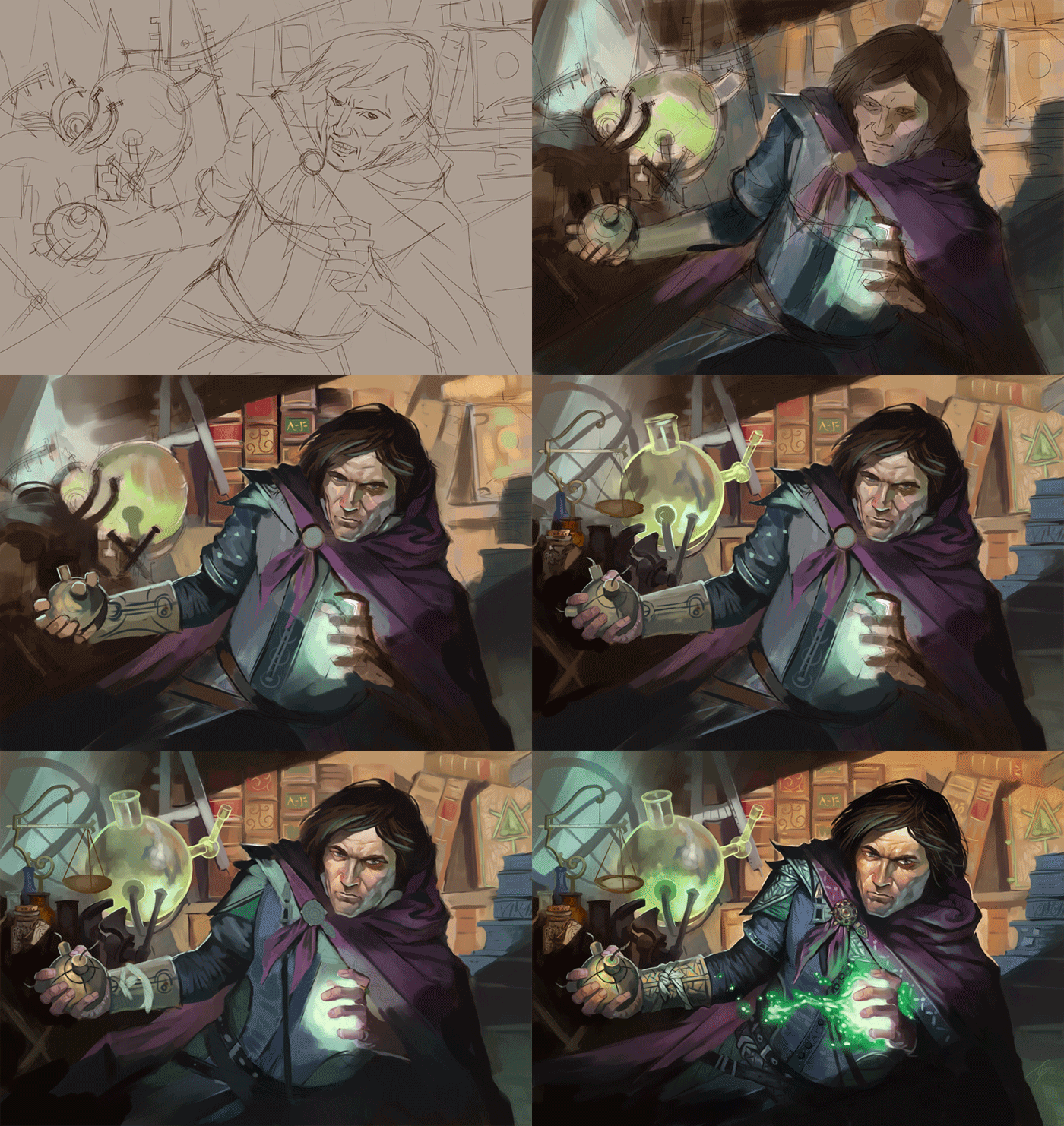
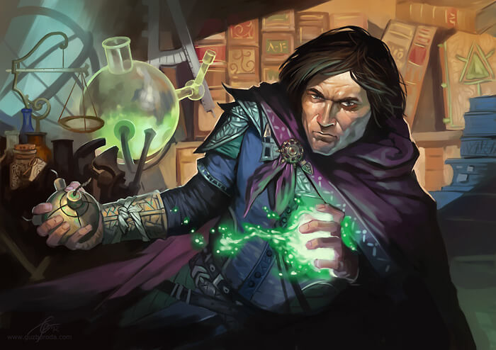
Hello everyone! I recently decided to document my work process for a Collectible Card Game (CCG) image. Creating for a CCG comes with its own set of rules. Typically, I can’t get too detailed, and I need to emphasize larger, eye-catching elements. CCG cards are small and often feature dark designs, so it’s crucial to highlight key elements for better visibility. However, in this case, my client requested a more detailed artwork with vibrant colors that can stand out against a dark background.
In the process of creating this artwork, you’ll notice a moment when I’m drawing on a beige layer. This is how I make significant changes. When adjustments are needed, I create a beige layer with 70% transparency and pencil drawing on a new layer. This approach allows me to use the drawing as a guide while working on the main color composition.
Feel free to view the animated GIF showcasing the final result
