When a user confused while using a design, it’s not his/her fault. It’s because the design is bad. Everyone is using Amazon and it’s already in the DNA of our Internet culture in general and in e-commerce in particular, this supergiant is also famous for the worst UX in e-commerce. Amazon website makes me so angry sometimes so I had to switch to other stores to buy what I need.
I have to say this Hate List first and foremost is coming from the point of view of a user/customer.
1. Give me all your money
Everyone nowadays justify the search results with “smart” algorithm. Amazon isn’t an exception. But why the 1st result is always wrong or simply opposite from what I’ve been looking for?

2. Where's Wally?
The UI in Amazon is famously cluttered. If you just go and look for any, not good but just any ready-to-use designs for e-commerce websites you will be surprised how clean and simply they look. Let’s take the top menu from Amazon (see the screenshot below). What is going on over there? How is Promotion correlated to the section Electronics & Photo? How Electronics & Photo correlated to the Headphones & Earphones in the dropdown menu of the search box? How the Hamburger Menu is correlated to the horizontal menu on the blue and grey backgrounds? And why the structure in Hamburger Menu is different from the menu in blue or grey backgrounds? What’s the structure of Amazon?

3. Simplicity
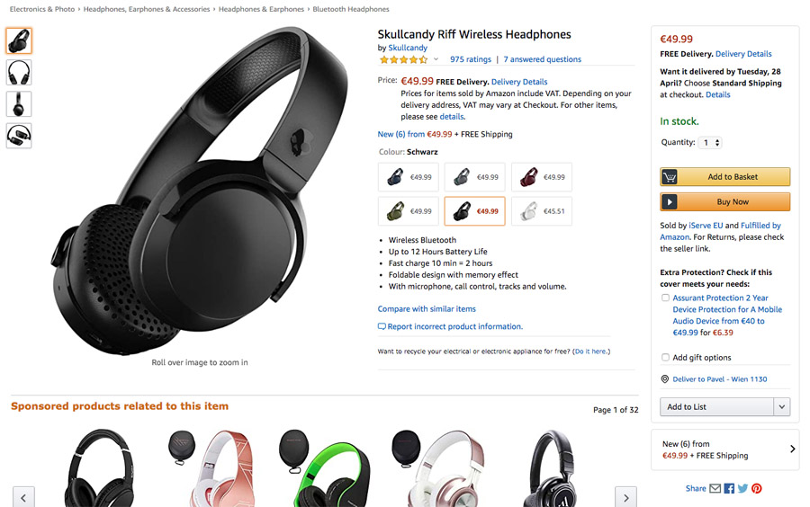
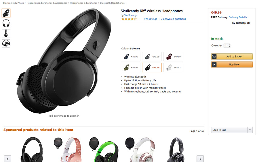
At some point I can face up to 256 links and buttons on a single page. So I tried a simple experiment. I removed all the not-essential information from the item page. Because, why do I need to see the price FIVE times on the same page? Why do I need to choose gift option when there is a whole step in the process dedicated to this? How about universal help? Content toggles? Just grab the bar and move it over the image below to see the comparison.
4. Text structure
Relying too much on font size and font color for your hierarchy is simply immature. There is no way to understand the hierarchy here. It’s a mess. And BTW why the color of the item is the smallest text here?
5. One more step
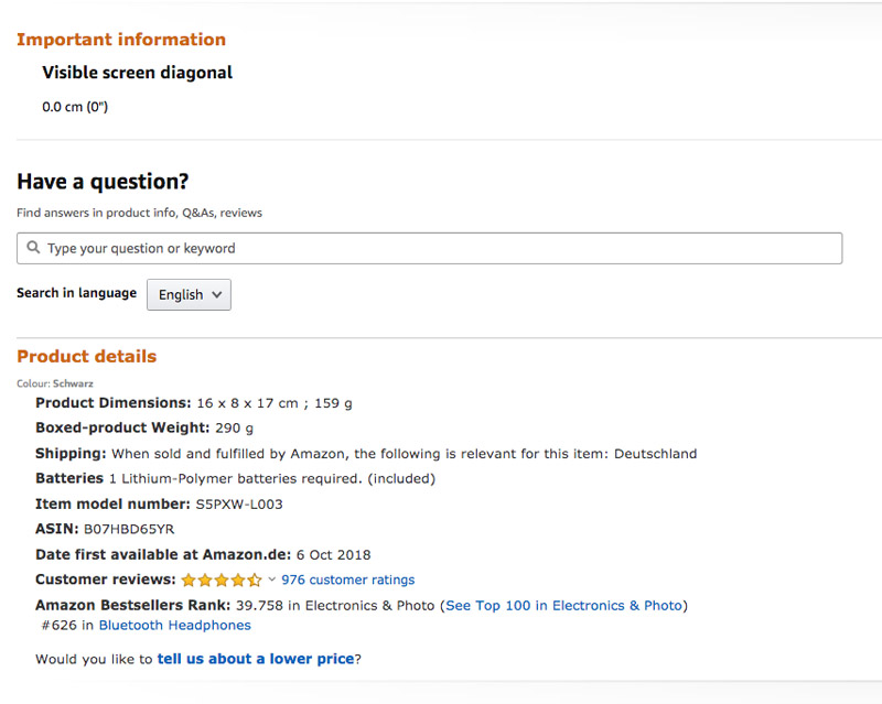
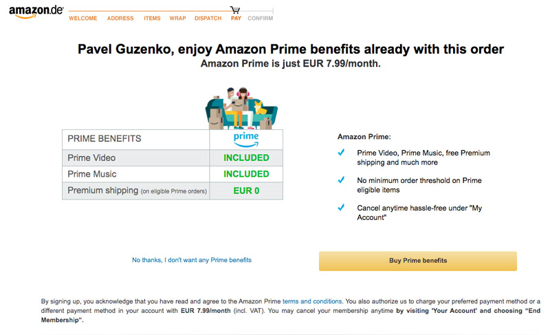
I’ve never understood this steps flow image. What Welcome step is or Address? Actually apart from Wrap, Pay and Confirm I don’t really know any of these steps.

6. Trick?
Despite the name of this step it is not a payment screen. I am not able to pay here. Payment screen is the next step. I know it, Amazon knows it. Why then?
I already know what Amazon has to say about it’s horrible UX. What basically any big company usually says, that they know better what’s the best. Unfortunately with this approach they assume that their customer is a stupid idiot who cannot understand why the search result contains what he/she specifically asked to avoid.
